When I was just a regular customer who makes frequent purchases on the Internet, I frequent left sites even at the checkout page. While the product they offered was of high quality with compelling discount offers, I was let down mostly by the checkout page. From a customer and now-expert on ecommerce websites, here is how I would design my checkout page should I am to run my own business.
Give users overview of your checkout page
The best thing you should do is to present all your checkout steps in one page. This would allow your customers to have a quick look on all of your required information. However, if you feel the need to use multi pages checkout, try to implement a pop-up/ indicator about where they are in checkout process.
Add more checkout button
Most websites have a checkout button at the top of their page. However, it is an inconvenient to scroll all the way up after you find your desired items. Adding a mobile checkout button would make customers think you want them away. The optimal number of checkout buttons should be two, with one at the top and one at bottom.
Add security verification from a third party
One of the most important reasons people don’t want to buy online is that credit card number are too easily to be leaked nowadays. If you are able to add a security verification from a trustworthy party to your checkout page such as “Norton Secured” (36% trusted) or “McAfee Secure” (23% trusted), your website will be perceived by customers as securable.
Ask for registration after checkout
There is nothing worse than having to fill a whole page of information to register if you are in a hurry to buy your product. While the aim of asking for registration is to attain returning customers, it could be a countereffect and demolish any chance of them coming again. What I am suggesting is to put that part in an appropriate timing: after checkout. Allow them to checkout as guests and after that, ask them if they want a registration in your page.
Allow customers to save their cart for later
Not all customers are decisive at their first time. They may want to check prices as well as products from different websites to compare. Saving your customers’ cart helps them save time and they will appreciate your effort.
Use exit popups to keep your customers
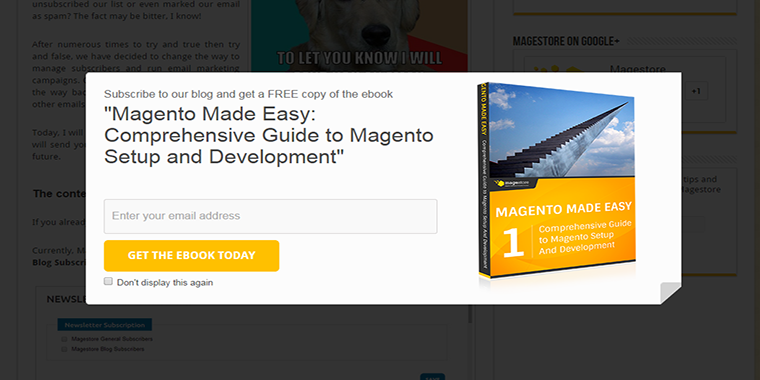
Exit popups are actually quite effective in increasing conversion rate. However, an inappropriate popup would irritate your potential customers at least. Popup should be used to offer an exclusive coupon code or time-based discount, encouraging your customers to finish the purchase.
Let your customer review in your checkout page
No one wants to pay for a mistaken product in his cart. The truth, as a seller, you can’t fully prevent these mistakes. Howerver, you can help your customer by presenting all of the information in another page and let them skim through the content over again for mistakes.
I have just shared with you my design tips for the checkout page. To convert customers and make millions, wait for my next article. Until then!
>>> Learn more about how to optimize your checkout process with
Part 2: Product
Part 3: Shipping
Part 4: Sales and Discounts


