
The color theory is always a hot topic for both designing and marketing. In fact, colors can drive many different emotions as well as actions of your customers. Making customers take action in your store is truly an art. And besides many factors make impact on how and what customers buy, colors maintain as the most persuasive and strongest element. To promote as well as persuade customers to buy your products, it is crucial to learn about What is the colors’ effect in E-commerce?
Research of colors’ effect by Kissmetric
Kissmetric is a well-known blog about marketing and analytics. They have a full research of Colors’ effect to purchasing decision of the consumers.
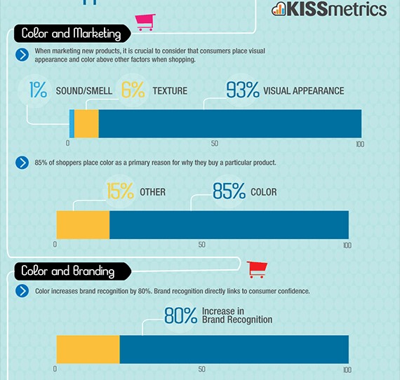
As you can see, for promoting a new product, it is essential use visual appearance than any other ways. As 93% customers are attracted directly by the visual appearance, and 85% of them choose color as the most impacted factor. Moreover, colors also contribute in brand recognizing by 80%.
With lots of people are impressed by colors, you should take a serious research about their effect. And colors also categorize in which business your store is.
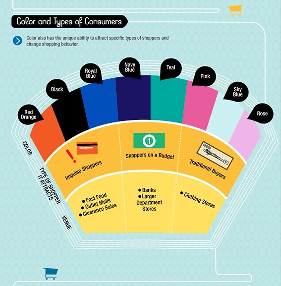
The research shows that red (and related colors), blue and black can attract type of impulse shoppers, that’s why we can see these colors most popular in fast food, outlet mails and even clearance sales services. On another side, green are more referred to money, will indicate the banks and larger department fields. Other colors will belong to traditional customers as well as traditional services like clothing store.
How colors affect sales increasing in E-commerce
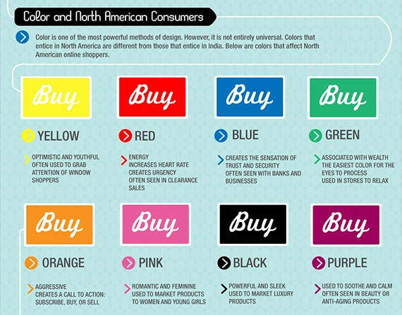
Colors impress the most important button of E-commerce online store – the “Buy now” button. However, each color brings different emotion as well as meaning. You can see the research also of Kissmetric about How colors affect the customer in North America.
Another deep research by The Logo Company will help you analyze what colors famous brands use and what they mean.

In summary, we can analyze these colors as below:
_ Yellow: This color has optimistic and youthful features. Because of this, entrepreneurs use yellow color to grab attention of customers. However, store owner should not abuse of using yellow to attract customers. Its power is certain and its clarity is quite impressive than others, but it affect really bad to customer’s eyes. It feels like looking at the sun without the sunglasses. When using yellow for the brand, almost business choose more additional colors to go with yellow, so they can reduce the yellow’s effect.
_ Orange: Orange is somehow the color of the youth, it could not be so attractive like yellow, however it is much cooler. That’s the reason why many brands of youth products focus on orange. We can imagine orange is just like the energy, but not a strong energy like red or glowing energy like yellow. Orange is the energy of youth, friendly and confident. For store owners, since orange is not strong as red, you can use for less important call to action.
_ Red: A common color, and a most popular in the life. Red is the strongest energy color, it grabs attention most effectively than other colors, without hurting their eyes like yellow. It also draws the aggression in most people inside, urge them to do whatever they are watching. Seem like people are just like bulls, right? That’s why store owners use red as the main color of “Buy now” button as well as other important call to action. Red also appears in many famous brands, and unlike yellow, they don’t even need an additional color.
_ Purple: This color is very creative, as well as imaginative. A perfect color of elegance, that’s why many beauty and perfume brands purple as their main (or maybe their sole) color. This color is quite similar to pink, and both bring the beauty and romance of female sides. While purple is more elegant, which attract mature women, pink is quite youthful and suitable for young girls. There are just a few stores use purple as the color of the Call to action button, except beauty and perfume stores.
_ Blue: Another common color, bring both the trust and cool to products’ brands. As the coolest color, blue shows the trust and security. That’s why many security systems use blue as their main color, and so does the security brands. In E-commerce website, store owners use blue for Customer Support to show trust for customers.
_ Green: A very versatile color, which can be both as cool as blue or as high energy as other light colors. Kissmetric told that green is the easiest color for eyes to process, and actually green bring both relaxing and pleasing feeling to customers. This peaceful colors can be added to reduce the power of other colors easily.
Using colors wisely and flexibly is one of the most important tasks in E-commerce. Are you ready to impress your customers now?
-> Learn about 5 incredible things to boost holiday sales for online merchants immediately.


