Checkout counter, also known as cash wrap or cash well, is no doubt one of the most important areas in a retail store.
It’s where your customers pay you.
An optimized cash counter also means higher efficiency, better branding, more satisfied customers and ultimately, more sales. Make sure your customers buy enough to come back to your store again.
So here are 7 proven tips to boost the look (and sales) of your checkout counter.
Trigger impulse purchases
According to CreditCards.com, 84% of survey respondents have made an impulse buy. 79% made most of their impulse purchases in a store.
With those statistics in mind, the Point-of-Purchase (POP) is the perfect place to encourage impulse buying.
Why? Because when a customer is at the checkout, he/she is ready to spend money at your store. This means they are more likely to make an additional purchase.
The best impulse products are small, inexpensive and self-explanatory. Customers can easily grab the items and add them to their shopping basket.
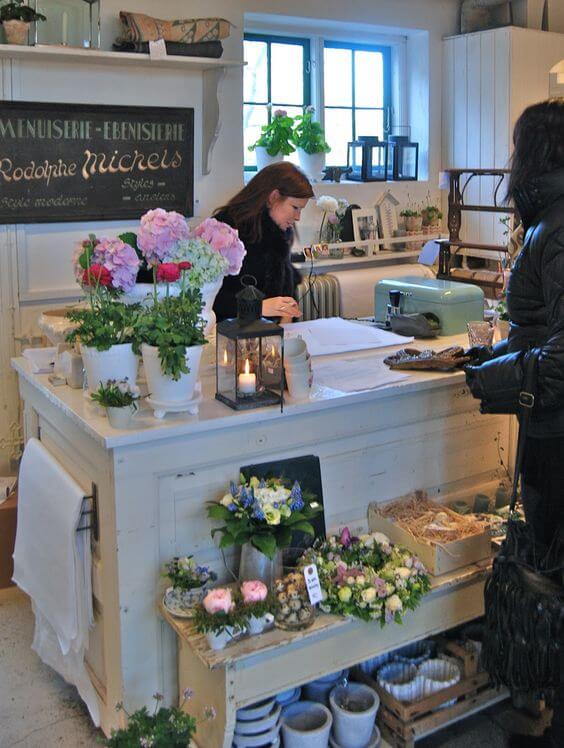
For maximum attraction effect, use highly visible, enticing packaging with an eye-catching signage like a sale or a key benefit of the item.
So what is the best merchandise for an impulse buy? There are a lot of suggestions for you to consider:
- Gift cards & Sale items
- Seasonal products (greeting cards, decorations, etc.)
- Complimentary products/ accessories (to your core products). E.g. pins and handkerchiefs for clothing stores
- Consumables E.g. batteries
- Small toys or kids’ products
- Travel-sized or trial-sized version of your in-store products
- Warranties and insurance (for appliance or electronics stores)
- Food and drink e.g. candy, chewing gum, chocolate, etc.
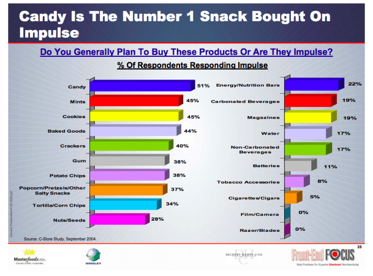
No matter what you choose, make sure you don’t confuse customers with too many options and overwhelm the area. Remember to continuously check these items to prevent out-of-stock or out-of-date.
Extra tip: Eye level is buy level. Products that are positioned at eye level are likely to sell better. So if you are trying to sell to kids, consider their age’s average height (and yes, an intimidating packaging, say Elsa princess!). And there you have a series of “Mommy can I please have that?”. 2 times of repetition and you’ll have it sold.
Convey the right message
Effective signages do make a difference.
In 2012, Sunfood has increased 30% of their average product turns after adding signages to their 5 stores. What they did was adding headers and side signs to their product displays.
But don’t just stop at product racks.
There are other spots like outside area, front window/ door, changing room. Store counter is also a key place in your retail store to promote your brand and upsell products.
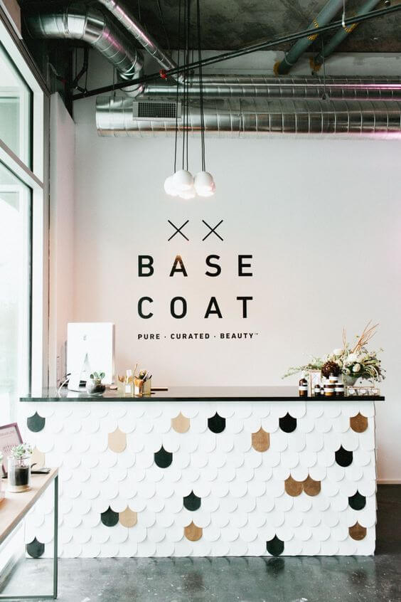
Extra tip: Try to think of what you want to communicate to customers at that specific stage of “customer journey”. Just make sure it is friendly, inviting, polite and positive. For example, display a good offer for the next buy or encourage social sharing at the checkout area when customers are already at a “buyer mood”.
Playful or Professional?
Your cash wrap design is important.
All those who actually buy from you will look at it. Do you want them to increase their attention span for branding/ upselling? Or do you just want them to think “Meh!” and walk away without remembering who you are?
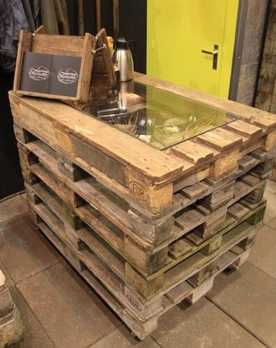
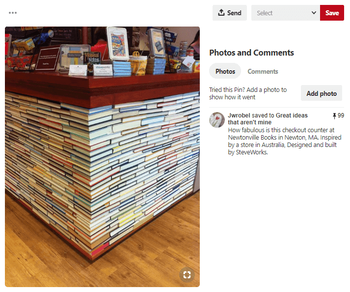
Make your counter stand out with colors and creative decorations.
It’s up to you whether to pursue a professional or playful style. Let your personality shine through. That’s how customers will remember about you and your brand.
Extra tip: No matter what style you choose, keep it consistent from your store to your website. For example, if you are selling women’s clothing and use hot pink as your primary color. Make it the main theme of your website too.
Equip a good POS system
A modern POS system boosts both the look and the functionality of your store.
Regardless of your fabulous decorations, the most important thing is a satisfying checkout experience.
Fast. Convenient. Personal. Can your POS meet these expectations?
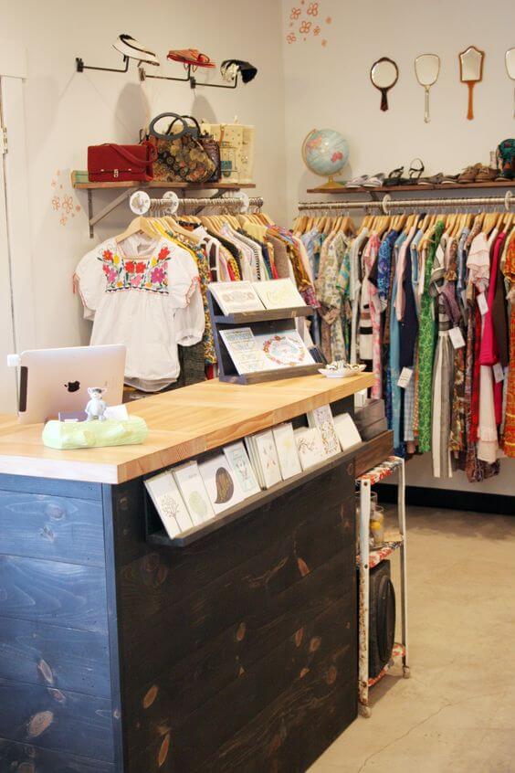
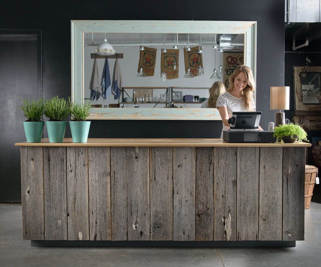
Do you have rushing customers who hate waiting lines, while those before them are still reluctant with making their purchase? Or those who constantly ask if your store accepts credit card since they don’t bring enough cash? POS software resolves all of these issues. You can also keep all customer’s information and recall them quickly in the next time they buy.
In short, a POS system acts as a cash register but looks much more standout.
Extra tip: If a POS system still sounds new, read this article to know more about an ideal POS for small businesses.
Adjust the lightning
The right use of light also affects your customer’s shopping behavior. It draws customer’s attention to your high-end products and makes them look even more luxurious. Try mixing different types of lightning and see what’s the best.
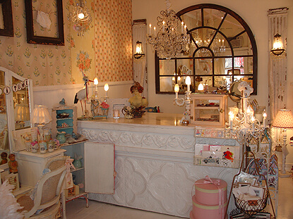
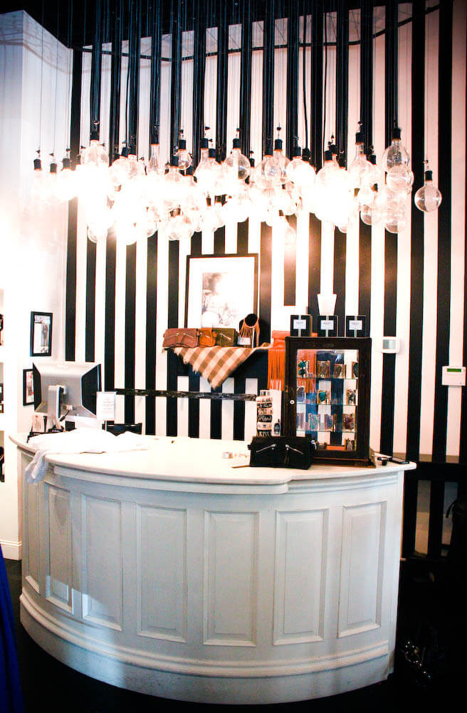
Don’t forget to check your lighting often and replace the broken ones. It’s the cheapest and fastest way to give your store a fresh new look.
Extra tip: If you’re after long-term benefits than short ones, consider using LED lighting. Although it takes a bit higher amount of investment, LED lights are 80% more efficient than traditional lighting and last much longer.
Add greenery
Many studies have proven that plants can improve people’s moods. Consumers who are happier tend to spend more than those who are in a negative mood. Adding plants is affordable and easy to maintain.
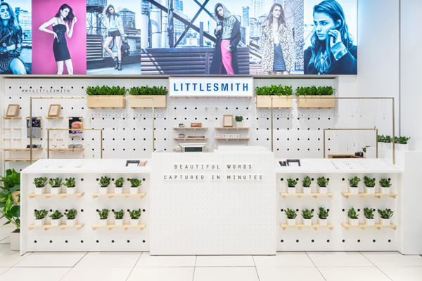
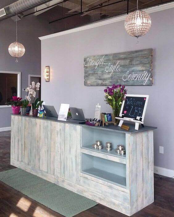
Indoor plants give a welcoming and soothing impression; while they help your staff relax during a long working day. This also means higher efficiency.
However, not all plants can live well indoor. Choose plants that require limited space and natural light. Some of the best options are pothos, aloe, spider plant, jade plant, shamrock, etc.
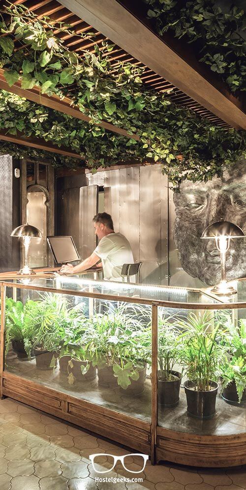
Extra tip: To bring a unique look to your store, make your own upcycled planters. Anything can do, from a small jar to a broken chair. Be creative! Just try to have a drain hole at the bottom of the planter whenever possible.
Utilize the back-wall
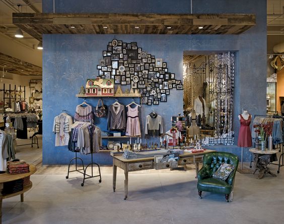
The wall space behind your checkout counter is also a perfect place to display products and make more sales. This is especially helpful for small stores with limited floor area.
Customers may overlook your highlight products in the crowded selling area. The white space on the wall will make your displayed products (and its promotion signage) stand out. Products in the display can be a newly-arrived, seasonal or high-demand items. So customers can continue shopping, even while waiting to pay for their purchases.
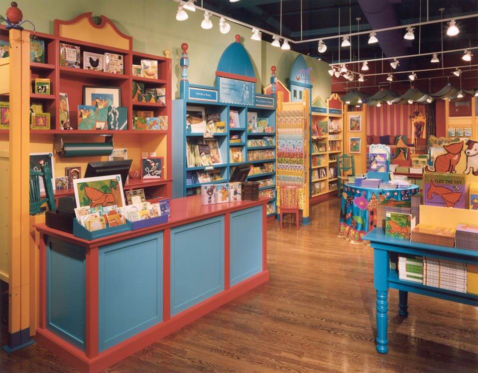
Extra tip: While 90% of shoppers turn right when they walk into a store, the front right wall is called a “power wall”. Many stores save this whole wall for displaying their top products and leave the counter to the left. Plan this wall nicely and match other walls to complement by using similar products. Customers can follow them as a shopping guide through your store.
Bottom Line
Your checkout counter is the last chance to make sales before customers leave your store. Take good care of it! That doesn’t mean you should implement all of the above tips at once. Test and track how customers react. Good luck 😉
Most related posts:
Point of Sale (POS): The Small Business Basic >>
How to Manage the Business Better in the Omnichannel World >>
How to Start a Retail Store that Complements an Online Business >>



2 Comments
Awesome tips! Really enjoyed it. I think pos software helps a lot in checkout but I also think It need some improvement in technology (specially if it uses AI then it would become a really awesome tool)
That’s a good idea, as long as the AI works well. It’s where the customers pay their money, so we won’t want any (troublesome) mess to fix later 🙂