Newer isn’t always better. In some cases, the tried and true methods are the best. Case in point: email marketing.
Email is a proven marketing channel that continues to be effective for eCommerce companies of all sizes. With over 4 billion people using emails, we can unanimously agree that email marketing is an excellent way to drive more sales for your online store.
But what makes an eCommerce email great? How do you define an effective email marketing campaign? And which email feature stands head and shoulders above the rest?
Join us to explore these five steller eCommerce campaign examples to find out!
Chipotle’s welcome email
Imagine you gave a fresh smile with belly bear hugs to every consumer that uses your sign-up form; how do you think new subscribers will react? Well, not repulsive!
Got us thinking; what does a “belly bear hug” welcome email actually look like? Or how do you make you’re ‘behind the keyboard’ smile and ‘static graphics’ look fresh in a welcome email? Maybe this Chipotle welcome email can help you get some ideas.

Preemptive header
Welcome gesture excites consumers more when they know you’ve been patiently waiting for them to come knocking—they feel relaxed and less pressurized exploring your catalog.
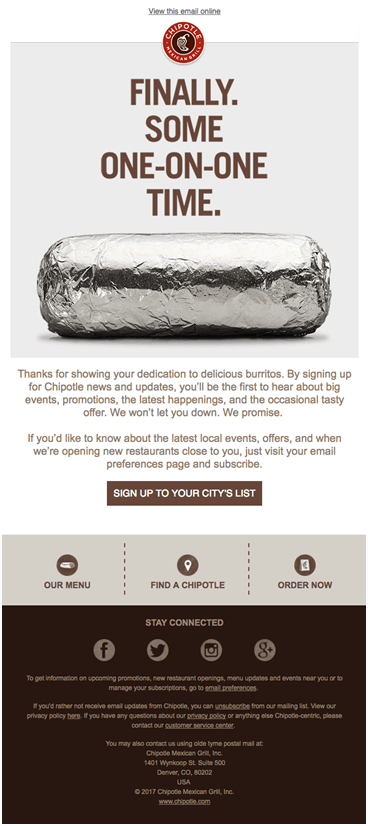
Look at the Chipotle email above. “Finally. Some one-on-one time”, do you feel the way its preemptive header kept an intuitive yet unspoken flow of emotion going?! You can do the same to get consumers started. 😉
Simple and descriptive copy
We know you might’ve experienced the thrill of keeping the best for last—especially from stand-up comedians. But this is different, and we recommend you make all the big promises upfront.
You can reread Chipotle’s email to learn the art of using simple words to amplify big messages. Or better still, add these five hacks to writing effective email copy to your toolbox.
Bold call-to-actions
When a long-awaited visitor finally makes the trip to your sitting room, and you’ve exchanged pleasant smiles and hearty cheers, what comes next? Do you keep your visitor standing or quickly invite them to sit?
Look at Chipotle’s welcome email. See how they arranged multiple intuitive CTAs at the email’s footer? You can do the same or draw inspiration to do better. 🤗
Moschino cart abandonment emails
Imagine a groom walking out of his wedding party without his bride—that’s what it’s like to watch consumers abandon their cart halfway through.
Abandoned carts are not pleasant to the eye, at least not for your eCommerce brand. With the right email marketing campaign, you can get exhausted, overspent, and even window shoppers back to buying ways.
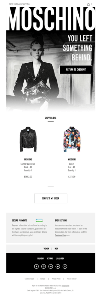
Let’s explore how this Moschino cart abandonment email does the trick.

Help them avoid feeling extravagant
Consumers prefer to shop extravagantly when people of interest are watching—not when they’re behind their smartphones looking for the best Moschino jacket. But that doesn’t mean they won’t go the extra mile to land a good buy.
The simple tagline ‘You left something Behind’ and the off-the-shelf model in Moschino’s cart abandonment email make all the difference. If consumers love what they see, they won’t mind breaking the bank to acquire it.
Show matching items
Every marketer prefers a simple lift up the elevator to a long walk down the stairs. But only the best eCommerce marketers know how to prioritize tried and true strategies that might require the strain of long walks.
When designing your cart abandonment email, avoid being sale-sy. Please don’t force the sale on consumers by immediately bombarding them with a bland old return-to-cart email.
You can spice things up by matching a product in their cart with other relatable items, then follow up with less expensive offers within the same catalog. Or better still, excite them with new offers, discounts, or promotions.
OFFHOURS back-in-stock emails
Being back in business is great. But having consumers troop in as soon as your stock arrives is even better. Back-in-stock emails can help you do this trick.
These emails keep your product in front of consumers and help new arrivals hit the ground running. If you’re wondering how, let’s steal a page from this OFF HOURS back-in-stock email and see what unfolds.

Installment payment
From OFF HOUR’s email template, we presume you already know that including matching items in your email is a sure-fire strategy. To get those matching items to hit the ground running, consumers need a little bit of laxity.
Thankfully, installment payment does just that. From the OFF HOUR back-in-stock email example above, the ‘Buy now, Pay monthly’ section stands out—allowing customers to feel relaxed around hot, trendy, or expensive arrivals.
Catchy images
You’re back in stock, and it’s only natural that your latest arrivals keep consumers glued. Just like retailers use a mannequin to reel in consumers, at first sight, your eCommerce back-in-stock email also needs images to create a lasting first impression.
Better’s relationship nurturing newsletters
Consumers don’t always welcome newsletters with pleasant smiles. They’d easily unsubscribe or relegate your newsletter to spam folders at the slightest inconvenience—except maybe they’ve been awaiting your update for an exciting product.
If you want to win with newsletters, you must learn to create relationship-nurturing personalized emails using messages that help your brand’s personality cut through the noise and leave a lasting impression. Something that gives your conversation context.
Let’s draw insight from Better’s playbook.

Extend a hand
Stop trying to use your newsletters to sell products or showcase discounts. They might do well at first, but you’d be at the losing end in the long run.
Newsletters continue to run the gamut in eCommerce email marketing because of the relationship nurturing possibilities they offer. It’s the easiest way to help consumers navigate industry-shifting trends and get on top of buying decisions.
In Better’s newsletter above, notice how they provided statistical information on how Fed rate hike is affecting mortgages? That’s a take-home you might want to prioritize.
Categorize your list
Marketers love newsletters because it helps them unflinchingly send regular emails to consumers and prospects. But just like all good things, the possibility of misuse is high.
Many eCommerce brands don’t work with categorized lists. They blast emails without second-guessing their usefulness to each recipient, leading to a high unsubscribe rate or unopened newsletters.
Quickly take a second look at Better’s newsletter, did you notice the ‘more homeownership help’ section? That’s the catch! Better knew exactly who they wanted to reach with their messaging and were able to offer personalized advice because they categorized their list.
Google’s special offers email
Customers also want a pat on the back for the time spent shopping at your store. They want to feel welcomed, appreciated, and loved. And they want that extra special that makes all the difference.
Frankly speaking, they deserve it. But how do you show consumers you care and wouldn’t mind breaking the bank for them without actually going bankrupt? Well, Google is a ‘been there, done that’ brand; let’s see what we can learn from their special offer email.

Make it time-sensitive
Every consumer deserves a special offer; it’s only right to keep them happy if you can. But the thing is, most marketers overthink it. They weigh the profit and loss margin, believing it’s out of control, and hold strongly to the possibility of loss in most cases.
In truth, you can control the chances of running a loss when offering special offers. You need to know how to market with emails.
Google’s special offer email offers insight with its time-sensitive message. The header “these deals won’t last much longer” attracts active buyers to make the best of it, deal-making it hard for one-time shoppers to take action.
Include a feedback channel
Winning with emails is not always about what meets the eyes. Sometimes, the slightest detail makes all the impact. When designing your eCommerce special offer email, include a feedback channel.
Consumers excitedly provide feedback to eCommerce stores that help them spend less for more.
You can add a simple feedback message like “leave a rating” or “drop a feedback”, it’d only take a minute, or better still, draw inspiration from the template above—Google’s “happy, neutral, and angry” feedback emoji.
Take your eCommerce email marketing campaign a step further
You can also use email marketing software to nurture your customers, increase customer retention rate and get more new loyalty customers.
Now that you’ve got an idea of what an effective eCommerce email campaign looks like, why not test the waters with an email marketing software that allows you to spend less for more? Go on and register with Sender to build a bridge between your email list and revenue.
About the author

Skirmantas Venckus is a writer by day and reader by night. He hates talking about himself in the third person. He is also the growth hacker at Sender.net—the email marketing provider that is focused on user-friendliness, affordability, and utility.
Visit his social media link.


