In Martin LeBlanc’s words, the essence of user interface design is akin to a well-crafted joke: it should be effortlessly understood without explanation.
Striking the delicate balance between innovation and user acceptance is critical to creating an engaging online experience. Considering this principle, we delve into Conversion Optimization Techniques for Designing Your Store.
From embracing new trends to ensuring accessibility, this blog explores the art of designing a website that seamlessly blends style and functionality. Join us as we unravel the secrets of Designing Online Stores that captivate visitors and drive conversions.
Core Principles of High-Converting Online Store Design
When starting your online store, you want it to be friendly and easy for customers. Here’s how to do that:
- Make Shopping Easy: Group your items clearly so people can find what they want quickly. When your store is simple to navigate, customers will enjoy it more and want to return.
- Think About Phones: Many people shop on their phones, so your website should look good and work well on them. This lets people shop from anywhere without any hassle. People prefer zooming in and out just to see what they’re buying!
- Speed is Important: Slow websites can be frustrating for customers. If your site takes too long to load, they might leave and go somewhere else. Ensure your website loads quickly so people can quickly find what they want and stay interested.
- Keep Checkout Simple: Make it easy for people to buy things. Keep the checkout process simple with as few steps as possible. Offering a guest checkout option can make it even easier for new customers.
- Build Trust: People need to trust your store before they’ll buy anything. Show them your website is safe and reliable by displaying badges, customer reviews, and security seals. When people trust your store, they’re more likely to purchase.
- Keep Improving: Your online store isn’t done when it first goes live. Keep trying new things and listening to feedback from customers. This way, you can keep making it better and more enjoyable for everyone.
Following these fundamental principles, you can create an online store design that attracts visitors and converts them into satisfied customers.
Top 9 Conversion Optimization Techniques for Designing Your Store
Optimize Website Speed and Responsiveness
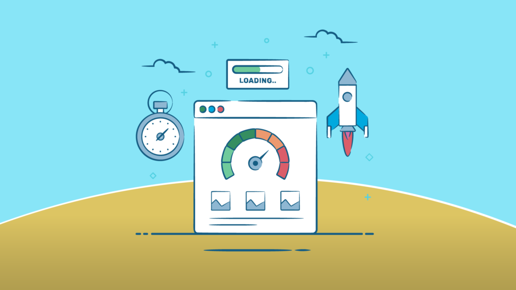
You must make it fast and easy to use to ensure people have a good time on your online store. If your site is slow and shows what’s available after some time, people might leave without buying anything. To reduce shopping cart abandonment, focus on making your site load quickly, getting rid of things that slow it down, and not asking for too much information.
Tips:
- Use tools to see how fast your site loads and find ways to make it faster.
- Think about important things on your website and get someone to help you improve them for search engines.
- Make your website look nice but not too crowded with stuff.
- Show people what’s in stock on different channels so they can easily find what they want.
- Use FAQs to answer people’s questions, which makes your website better for them and helps you sell more.
Optimize Search Engine

Generating traffic is vital for success, and one of the most effective techniques is optimizing search engine visibility. While keywords play a critical role in Search Engine Optimization (SEO), more than focusing solely on them is needed to drive conversions. It’s essential to grasp and address diverse search intents to attract the right audience and transform visitors into customers.
Tips:
- Use keyword optimization to target specific search intents and attract the right audience to your website.
- Keep abreast of the latest SEO strategies and web design trends to maintain your website’s competitiveness.
- Perform comprehensive keyword research to pinpoint your industry’s most relevant and commonly used keywords.
- Analyze competitor keywords to gain insights into strategies and inform your keyword targeting approach.
Create User-friendly Navigation
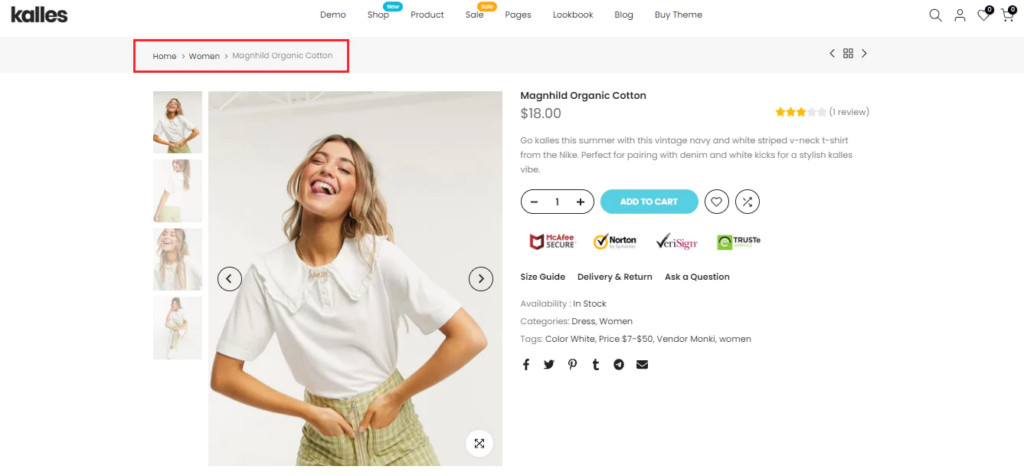
Easy-to-use navigation is like a map for your Shopify store, helping visitors find what they want without getting lost. It means organizing your website’s layout, menus, and links so they make sense and are easy to use.
Good navigation makes visitors happy, keeps them from leaving your site, and helps you sell more. When people can easily find what they’re looking for, they’ll think highly of your brand and return.
Tips:
- Keep your main menu simple with clear labels that match what’s in each section.
- Arrange your website’s content logically so visitors can quickly move from big categories to smaller ones.
- Ensure your search bar works well so people can quickly find their needs.
- Use breadcrumb trails to show people where they are on your site and how they got there.
- Ensure your site works well on phones using menus that collapse or look different on mobile devices.
Incorporate a Clear and Prominent Call to Action (CTA)
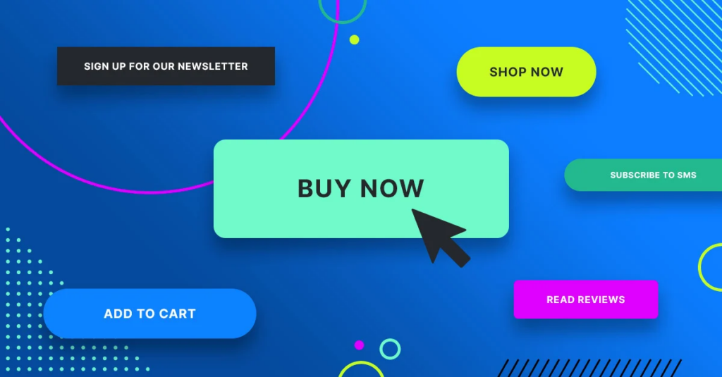
Hubspot found that using clickable phrases like ‘Buy Now’ in your blog can boost sales by 121%. People who visit your website should quickly understand what you’re offering and why it’s great. This is where a clear call to action (like ‘Sign Up’ or ‘Shop Now’) comes in handy. Having just one explicit action for visitors on landing pages is best. This makes it easier for them to decide what to do, move through the buying process faster, and increase sales.
Tips:
- Make it easy for visitors by offering just one choice with your CTA. Too many options can confuse them.
- Put your CTA at the top of the page where people can see it immediately. You can have more than one button that leads to the same action.
- Use active words like “Sign up for free” to get people to click.
- Tell people why they should act now, like saying, “Claim your offer today.”
- Try different button words, places, and colors to see what works best. Even small changes can make a big difference.
- Get a good logo for your website that shows the same on every page. This helps people recognize your brand and trust you.
Use High-Quality Product Visuals
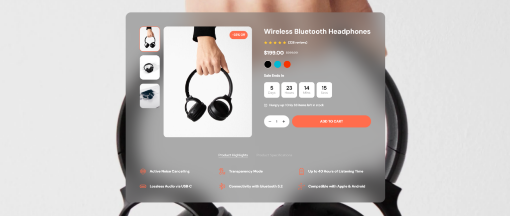
Creating an attractive product page involves making your website look great and showing off your products with fantastic images. Good images help customers know exactly what they’re getting, and they are super important because they shape how people see your brand.
Tips:
- Depending on what you’re selling, use big pictures or lots of smaller ones. Show off different sides and details.
- Get ideas from other websites in your industry. For example, if you sell makeup, look at what other makeup websites are doing.
- Clear, high-quality photos and videos make customers confident about buying from you. They know what they’re getting.
- Let customers see your product from every angle with a 360-degree view. It helps them decide if they want it.
- Videos showing real-life situations make the product feel more natural and help customers imagine using it in their own lives.
Craft Engaging Product Descriptions
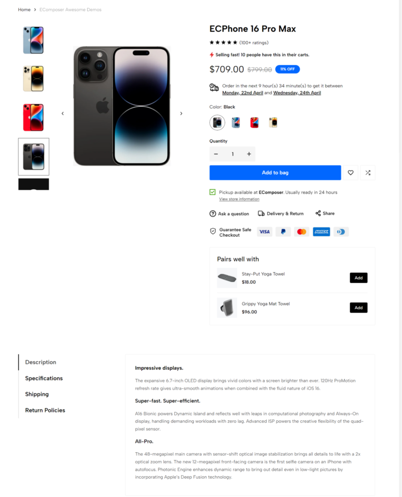
Writing interesting product descriptions is essential. It helps ensure that excellent products aren’t missed because there isn’t enough information on your website. Once you’ve caught people’s attention with photos, giving them lots of details about the product becomes necessary. Keeping these descriptions clear and up-to-date adds value to the shopping experience and makes people more likely to buy.
Tips:
- Regularly update and align product descriptions to enhance the customer journey and increase the likelihood of conversion.
- Ensure the product description is comprehensive and gives customers all the information they need to make an informed purchasing decision.
- Craft product descriptions that enhance the customer’s experience by highlighting the product’s unique features, benefits, and potential uses.
- Clarity and Conciseness: Product descriptions should be clear, concise, and easy to read, avoiding unnecessary jargon or technical language that may confuse customers.
Implement Upselling and Cross-Selling Techniques
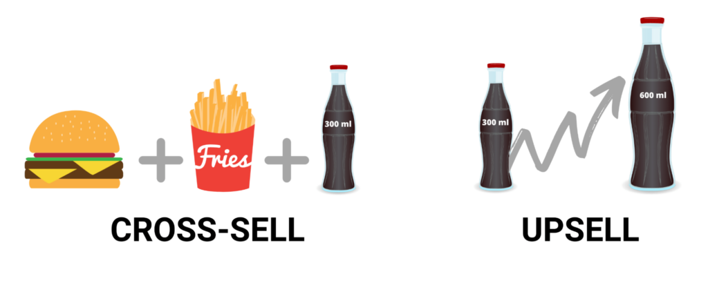
Using upselling and cross-selling techniques is a helpful way to catch customers’ attention and boost sales on your online shop. Upselling means suggesting fancier or better products in the same category as what the customer is looking at. Cross-selling means recommending other items that go well with what customers are buying.
Tips:
- Recommend products that fit what your customers are looking for. This builds trust and keeps them coming back.
- Explain clearly the benefits and features of the product. This helps customers feel confident about their purchases.
- Offer upsells and cross-sells at the right time when customers are likely to agree.
- Pay attention to what customers say and use their feedback to improve your upselling and cross-selling.
- Use technology, like data analysis, to understand what customers want.
- Share reviews from other customers to show that your products are good and help people decide to buy more.
Provide Live Chat Support
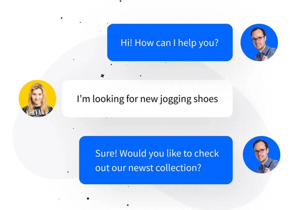
Live chat support is essential for efficiently attending to customer queries and ensuring a positive user experience on your e-commerce platform. While automated suggestions play a role, live support allows customers to interact with an actual human being for personalized assistance, similar to the experience in a physical store.
Tips
- Live chat support enables efficient customer assistance, similar to the support provided in brick-and-mortar stores.
- Enhancing User Experience: Live chat support enhances the overall user experience by providing real-time assistance and addressing customer concerns promptly.
- Offering round-the-clock support through a combination of chatbots and live chat ensures that customers can receive assistance whenever needed, leading to higher satisfaction and retention rates.
- Place live chat buttons on all website pages so customers can quickly contact you when they have difficulty.
Ensure Consistency In Website Design
Consistency in design, colors, fonts, and tone across your brand fosters trust and familiarity with customers. It enhances brand recognition, professionalism, and reliability, increasing customer satisfaction and loyalty.
Tips:
- Develop a comprehensive brand guideline delineating design elements, color palettes, fonts, and tone of communication to uphold uniformity across all channels and materials.
- Employ uniform design templates for product pages, blog posts, and other content to ensure visual consistency and coherence across the website.
- Position your logo consistently on every page, ideally in the exact location, to facilitate effortless brand recognition and fortify brand identity.
- Stick to consistent fonts and color schemes throughout your website to ensure visual coherence and enhance brand recognition.
- Maintain consistency in styling buttons, icons, and interactive elements across the website to provide a seamless and intuitive user experience.
- Keep your content’s tone and language consistent to reflect your business’s character and effectively resonate with your target audience.
What Are Common Design Mistakes to Avoid?
Usually, a website that is considered adequate and attracts many customers has a beautiful design. Website design plays a significant role in building your website, but this is a challenging task to do. Sometimes, you can still make unnecessary mistakes that reduce the effectiveness of the customer experience and the website’s conversion rate. In this section, we want to mention the errors that our entrepreneurs often make when designing their websites; please refer to them to avoid mistakes:
- Cluttered layout: Your website risks overwhelming visitors and making it easier for them to find what they are looking for if it has to load more images, content, or features than it can handle. You must always keep your layout clean and organized to ensure easy navigation and a more enjoyable browsing experience.
- Poor navigation: Complicated navigation menus or unclear paths can frustrate users, leading to site abandonment. You need to ensure the navigation is intuitive and user-friendly, allowing visitors to explore your products or content without quickly getting lost.
- Slow loading time: Customers can only patiently wait for the website to load for up to 5 seconds. Long load times can cause high bounce rates and reduced user engagement. Your website must be optimized for loading speed for a seamless browsing experience across all devices.
- Lack of mobile optimization: Almost everyone uses their phone to shop. Given these shopping habits, ensuring your website is fully optimized for mobile devices is essential. Create designs that accommodate a variety of screen sizes and resolutions to improve user experience, accessibility, and conversions.
- Inconsistent branding: Inconsistencies in branding elements such as colors, fonts, and images can weaken your brand identity and confuse visitors. To strengthen trust with customers, you need to consistently maintain your brand image across all pages and touchpoints.
- Ignoring Accessibility: Accessibility is an essential aspect of website design that is sometimes overlooked. However, you must ensure that all users, including those with disabilities, can access and interact effectively with your website. You can enhance the comprehensiveness and user-friendliness of your website by incorporating features such as alt text for images and keyboard navigation.
- Lack of clear calls to action (CTA): Omitting clear and prominent CTAs can hinder conversions by leaving visitors trying to figure out what to do next. Your website needs to be strategically placed with attractive CTAs to guide users to purchase or sign up for a newsletter.
- Consider performance monitoring: Continuous monitoring and analysis of your website performance is essential to identify areas for improvement and optimize user experience. Remember to track metrics like bounce rate, conversion rate, and page load speed, which helps you identify any issues and make the necessary adjustments promptly.
By avoiding these common design mistakes, you can create a more engaging, user-friendly, and conversion-focused e-commerce website that effectively meets the needs and expectations of your target audience.
5 Success Stories With Good Website Design
Nugget
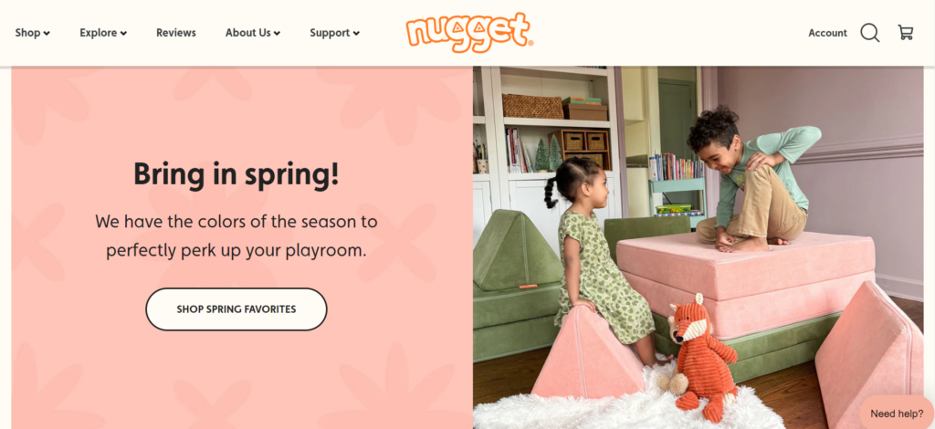
Nugget’s website design is eye-catching and unique, using colors like burnt orange, sage green, and peach instead of the usual boring ones. These colors match Nugget’s fun and youthful vibe, which is perfect for parents visiting the site. They also use cute drawings that remind you of kids’ books, making the site even more charming. By sticking to just three primary colors, everything looks nice and goes together well. They also make essential buttons stand out by using slightly different shades of the same color.
Overall, Nugget’s website design perfectly fits its brand, keeps parents interested, and makes browsing the site fun.
Website: nuggetcomfort.com
Magic Spoon
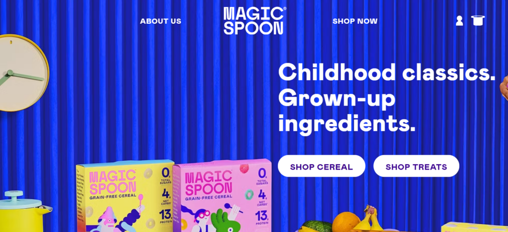
Magic Spoon’s website design brings back childhood memories, matching its cereal box’s fun and colorful style. This makes it feel nostalgic and playful, just like the brand itself. Keeping the website consistent with the packaging makes Magic Spoon seem trustworthy and reinforces its good reputation. They also use emojis to add personality and make the site more fun. Plus, they show off their most popular products at the top of the page, so you can easily find what you want.
Overall, Magic Spoon’s website design captures the brand’s vibe, making browsing the site a fun trip down memory lane.
Website: http://magicspoon.com
OLIPOP
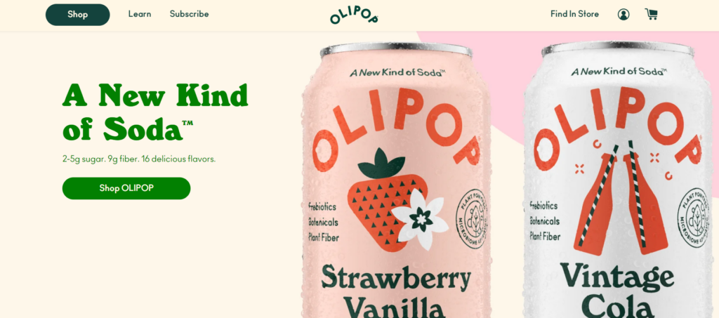
OLIPOP’s website design matches its goal of offering healthy sodas that are good for your gut. The site feels fresh and friendly, making you want to check out what they have. They mention celebrities like Camila Cabello, who like their drinks, which makes you trust that they’re good. The product page is excellent, too – the colors change depending on your chosen flavor, which looks neat and keeps you interested.
Overall, OLIPOP’s website is easy to use and showcases its products well, making it a great example of good branding and marketing online.
Website: drinkolipop.com
Couplet Coffee
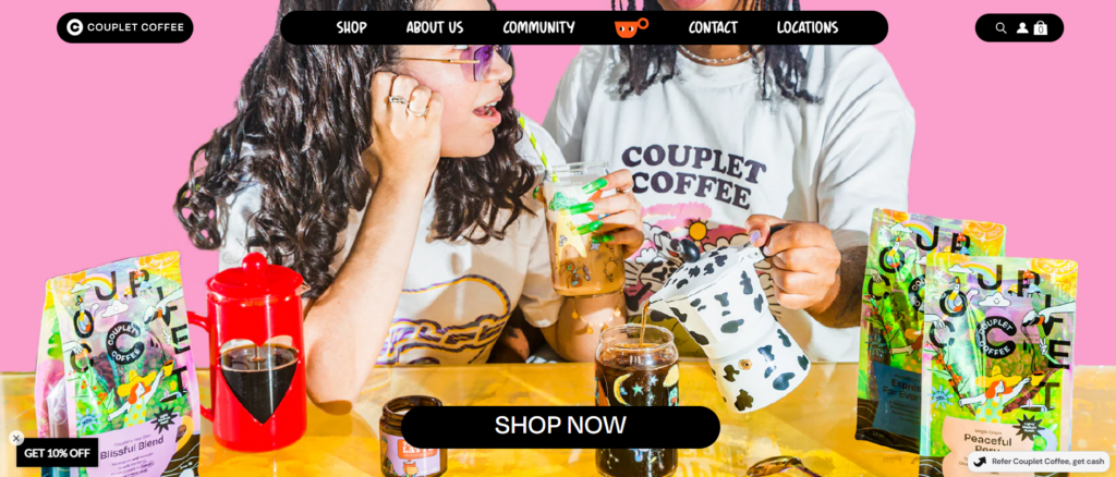
Couplet Coffee’s website design has a relaxed comic book style, making it fun. It uses funny pictures and moving stuff, like the free shipping bar, to catch your eye and get you involved. You can learn about them in different ways—reading, looking at pictures, or even listening. It also uses different fonts to make certain words stand out and keep things interesting.
Overall, Couplet Coffee’s website is fun and easy to use, making it a great place to browse.
Website: coupletcoffee.com
Hauser
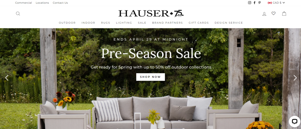
Hauser’s website design is simple and easy to use, making it a breeze to find excellent home furnishings. It has a dropdown menu that helps you navigate all its products without feeling overwhelmed. The site looks classy, with nice pictures and clear writing. Everything’s easy to read, and they use big, solid fonts to keep it looking stylish. It also has buttons that make it easy to buy stuff and a quick checkout process.
Overall, Hauser’s website is good-looking and practical, making it a great place to shop for indoor and outdoor furniture.
Website: hauserstores.com
Best Design Tools To Elevate Your Store
Best Design Tools for Shopify Store
There are many website page builder apps on Shopify. In this blog, I will introduce you to a page builder app for the Shopify Store from EComposer.io.

Many customers consider EComposer a user-friendly tool. It is designed for businesses of different sizes in all fields and offers many customizable templates that make finding the perfect design for your business easy.
Furthermore, EComposer integrates many advanced features to help customers easily create professional websites. Now, let me look at why EComposer is special:
Powerful Drag-and-Drop Editor:
EComposer’s live drag-and-drop feature is one of its most outstanding features compared to its competitors. This feature lets you quickly move any element to your desired position in the EComposer editor.
This feature stands out in its simplicity and is user-friendly to everyone. Whether you have experience or expertise in coding, personalizing your website becomes more manageable and saves time.
Extensive Library of Templates
EComposer offers lots of ready-made templates for your website. You can change them to match your brand perfectly. There are templates for different types of businesses, so you’ll find the right one for you.
With EComposer, you can easily change your website’s colors, fonts, and arrangement, making it stand out from others.
Mobile Responsiveness
EComposer ensures your website looks fantastic on phones and tablets so customers can easily browse. It changes how your website looks to fit any size screen. This means your customers can look around, buy stuff, and use your online shop hassle-free.
Various Shopify Apps Integration
EComposer works with other apps to add more cool stuff to your website. For example, it can add email marketing tools, social media connections, and customer review features. This makes your website better.
With this feature, your Shopify stores can easily add new features to their websites so your sites can change and keep up with what customers want.
24/7 LiveChat
EComposer cares about helping its users. If you ever have a problem, they’re quick to fix it. They have many ways to help, like guides and tutorials, email support, and live chat, which is always available.
This is super helpful for businesses trying to figure out how to build a website. EComposer’s support team ensures you get fast and helpful help to keep going without wasting time.
Best Design Tools for Magento Site
Similar to Shopify, Magento is also a platform with many apps to support you in website design. One of the typical apps I want to introduce is Page Builder.
for Magento 2 comes from Tapita.io
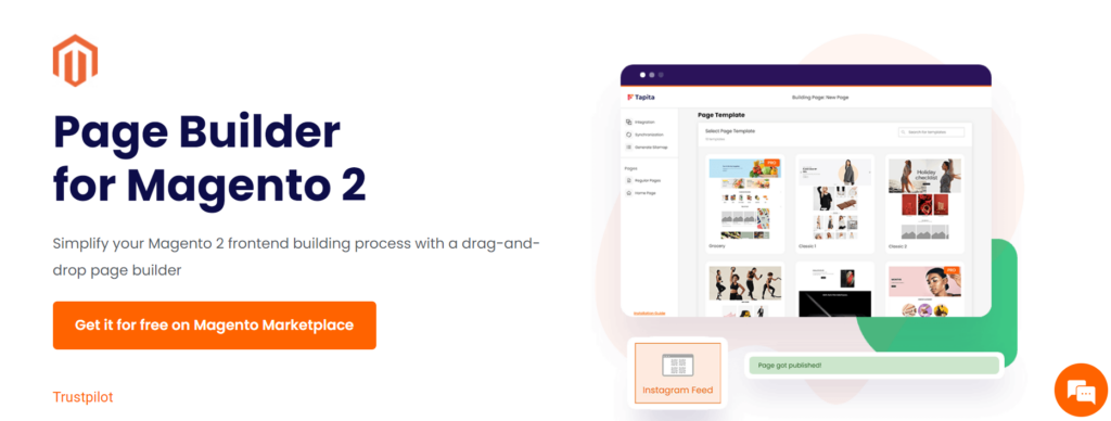
This Page Builder Tool has many highlights, including:
Many Outstanding Features
Tapita has over 25 elements, including text blocks, image galleries, and contact forms, helping you build dynamic and engaging websites in minutes. This tool also has over 40 professionally designed templates catering to many industries, so you can start your design process and achieve great results immediately.
Flexible Customization
One of Tapita’s standout features is its versatility. Not only can you customize page elements using built-in options, but you also have the freedom to add your own HTML, CSS, and Javascript code to make your pages your own. Plus, with SEO-efficient features like meta titles, meta descriptions, alt tags, XML sitemaps, and lazy loading, you can ensure that your pages rank highly in search engine results. Search engines attract more organic traffic.
Seamless Integration
For those who want to take their web development to the next level, Tapita integrates seamlessly with PWA Studio and ScandiPWA, allowing you to build UIless UI interfaces that deliver productivity, great performance, and a great user experience.
Best Design Tool for WooCommerce Site
With WooCommerce, we recommend you use Elementor as the right solution to build and design your store. This Page Builder is trusted by over 5 million websites worldwide for its great flexibility and user-friendly interface.
If you’re not convinced yet, let me list a few of its highlights:
Easy to Use
The shallow learning curve of Elementor makes it an attractive option for users of all levels of expertise. Novices can quickly grasp the basics of designing and building their WooCommerce store, while seasoned developers can easily delve into more advanced features.
Additional Widgets
Elementor offers a vast library of additional widgets beyond its core functionality. These widgets enable users to add various elements to their website design, such as sliders, galleries, forms, and more. This abundance of widgets provides endless possibilities for customization and creativity, allowing users to tailor their stores to their specific needs and preferences.
Free Plugin
Elementor’s free version provides robust features ideal for users just starting with their WooCommerce store. The availability of essential features without needing a financial commitment allows users to explore and familiarize themselves with Elementor before deciding whether to upgrade to a premium plan for additional functionalities.
Final Thoughts
To summarize, making online stores that sell a lot is about mixing creativity with intelligent planning. Everything matters, from ensuring people can find your store online to making your products look cool and exciting. Keep learning, listening to what people say, and keeping up with what’s popular to make online shops that people love coming back to.

