
What makes a store successful?
You might think of great products, excellent customer service, or affordable pricing. But did you know that the physical design of the store, particularly the layout and your point of sale (POS) systems, can have a massive impact on your success as well?
These two elements might seem like minor details to worry about (and may even seem unrelated to each other), but they heavily influence your customer experience. When paired thoughtfully together, they guide better traffic flow, remove bottlenecks, and maximize conversion.
In this article, we’ll explore how store layout and POS design are connected, and how you can sync them to boost the success of your retail business.
How are store layouts and POS design related?
These two elements may seem unrelated at first glance. After all,
- Store layout is how the products are organized and how customers physically move in the space
- POS system is your hardware or software to process payments and transactions
They have different purposes, but they intersect at the most important part of a customer journey: the purchase.
Both can influence your customers’ interests and behavior. For example, consider your layout. Can your customers see all your products? Are they displayed enticingly? Is it easy to maneuver in your store, thus making it more appealing to wander around? And so on.
The layout also affects how easy it is for your customers to complete their purchase. What if a customer wanted to buy something, but they couldn’t find your checkout? Or what if your checkout is placed in a high-traffic area, making it hard to get to? If your customers decide to just leave, then that’s wasted money — which is why integrating social proof (for example, via UK UGC creators) around the POS experience can help reduce dropoff.
Then your POS design. No matter how beautiful and seamless your layout is, it will all crumble if your checkout process itself is difficult to use. If they’re too few in numbers, physically hard to access, or are so buggy that it doesn’t work properly, then customers will just get frustrated.
See? They are different elements, but their goal is the same – and that is to remove any barriers between your customer’s desire to buy and how they can complete their purchase.
Top store layouts and the right POS design for them
Let’s now take a look at the most common store layouts and the POS design you can pair it with for maximum efficiency.
Grid layout
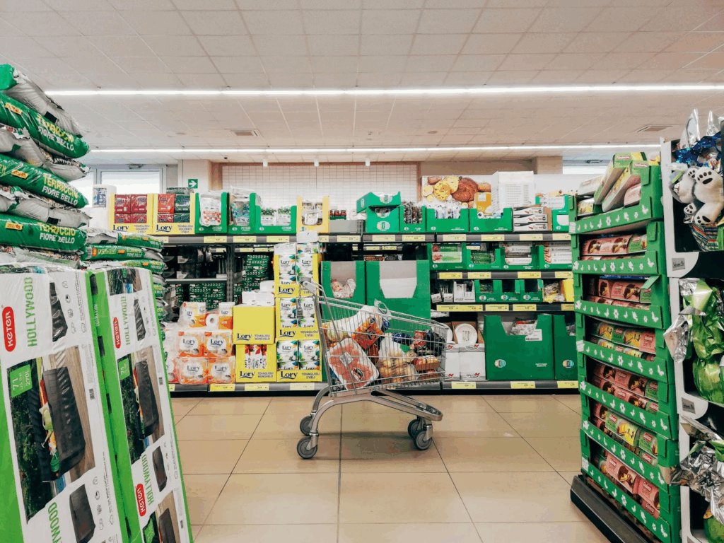
This layout features long aisles arranged in straight lines, with products grouped by category. You’ll usually see this in groceries, pharmacies, hardware stores, and convenience stores. This layout is all about function and efficiency, as customers typically know where things are and easily get what they need.
But there are still some ways retailers can subtly nudge them to buy more products. This is by placing impulse-type items near the front and staple items in the back. This way, customers have to pass by these items before getting their staples, thus maximizing product exposure and potential sales.
Since this layout is typically used by retailers that expect high traffic, your POS design should be able to handle that.
- Place your checkout counters near the store exit, where customers naturally end their journey
- Have multiple lanes to accommodate a high volume of people and lessen wait times
- Have an express lane for customers with fewer items
- Offer self-checkout kiosks
- Integrate multiple payment methods and contactless options to speed up transactions
Loop layout
This layout has a forced pathway that winds customers throughout the store. It starts from the store entrance, guides customers to walk through every merchandise, and then ends at the checkout area.
It’s designed for maximum product exposure and longer browsing times. It’s typically used by department stores or large apparel chains that want to encourage full-store engagement. Ever been to IKEA? That’s probably the best example of a loop layout in action.
However, one con of this layout is that it can be frustrating for customers who already know what they want or those who only want a specific item. Your POS design can mitigate this by:
- Place a few checkout counters mid-loop, especially near high-traffic areas like fitting rooms or promotional displays, to accommodate customers who have already found what they are looking for, or to capitalize on impulse purchases
- Primary checkouts should still be present near the store exit
- Use signage or markers to guide customers to the counters, so they don’t feel like they’re walking endlessly with no end in sight
Free-flow layout
Free-flow, as the name suggests, doesn’t really impose a strict pattern or path on its customers. Rather, they encourage customers to wander through the store and browse.
These are typically used by boutiques, pop-ups, lifestyle stores, or smaller shops. It’s ideal for businesses that want to focus on aesthetics, storytelling, or brand identity.
It’s also great for retailers that want to offer a more experiential experience, such as having interactive displays, mini-games, or product demos.
Staff typically have a more active role in these layouts, as this layout gets more customer interaction. A great POS system to accommodate that would be:
- Use mobile POS systems, so staff can process payments on the spot and eliminate the need for the customers to walk to a counter
- Have staff encourage cross-sell or add-ons to their purchases
- Match your POS design to your branding to maintain the look and feel of the environment. You can do this by adding your logo design, color palette, or matching the material to your store’s aesthetic (such as using wooden displays or metallic floorstands)
Best practices for aligning layout and POS design
Here are the top tips to ensure that your store layout and POS design are aligned from the ground up:
- Understand customer behavior
The success of both will depend on how well you know your customers.
Do they like to linger and browse? Or do they prefer to quickly get what they need? What kind of displays get their attention? What kind of checkouts do they prefer?
These kinds of insights can be found by using tools like heatmaps, foot traffic analysis tools, time-lapse videos from your in-store camera, or simply observing your customers.
This should help you spot patterns that you can use to find the right layout and POS system. For instance, you may find that your customers tend to go to the right when entering your store. Then you can start your loop pathway from the right, or display more high-value items on that side.
You may also find that you have younger or more techy customers. This means that you can incorporate more mobile POS systems or self-checkout stalls, compared to if you were dealing with older customers who prefer more traditional cashier registers. And vice versa.
- Design them at the same time
Businesses often think of these two as separate tasks – one for the architect and one for the IT/operations team. But this approach often leads to inefficiencies and missed opportunities.
Instead, think of them as one system. Plan them together. As soon as you have a layout in mind, you should identify where your checkout will be placed. This should help you spot issues early, like poor outlet placements, blocked pathways, or too long walks.
- Leverage impulse buy
Let’s be real – all businesses want to get as many purchases from their customers as possible.
Your POS system, combined with a strategic layout, is the best place to push more of those small, tempting items into your customers’ shopping carts.
Here’s how you can do it:
- Place small items like snacks or accessories near your checkout lanes
- Have your limited-time offers or sale products near the checkouts
- Train staff to always upsell or cross-sell
- For self-checkout kiosks, add suggestions like “Customers also bought” or “Best paired with”
- Have a seamless omnichannel alignment
Integrating digital tools into your physical stores (and vice versa) can take your business to the next level.
Let’s take a look at your layout. You can improve it by:
- Adding a wayfinding screen, especially if you have a large or multi-floor store
- Having scannable QR codes on shelves or products that can display product info, such as reviews or sizing guides
- Having interactive displays, such as one where customers can do virtual “try-ons”
- Have digital kiosks or tablets to let customers browse online options if an item is out of stock in-store
How about your POS design? You can sync them with your CRM so you can have access to your customer’s online and offline data, such as purchase history. This makes it easy for your staff to process any returns, solve any issues, or track points for your reward programs.
- Make sure they both reflect your branding
Your store and POS design should always match your brand’s vibe.
For instance, if you have a luxurious brand or a rustic, all-natural website created with your website builder, then your store should reflect that.
It helps create a more cohesive experience, not only from online to offline, but from the moment they encounter your brand (which is usually through your logo!).
How do you do this? First, your POS counters and displays should carry your visual identity. Use your brand colors, typography, imagery, and other visual elements.
The same goes for your store displays. Take a look at Sephora. Their sleek, minimalist, black and white aesthetic is visible in their stores, which perfectly matches their chic brand identity.
Another is Nike. Their branding is all about athleticism and movement. So they have interactive displays in-store where customers can move in front of a camera and see how their dri-fit shirts can wick sweat in real time.
Even your brand voice matters. Whether you aim for knowledgeable, approachable, or luxurious, it should be reflected everywhere – from the captions in your signage and payment instructions to how your staff interacts with customers.
Conclusion
Your store layout and POS design are usually thought of as two separate entities, but they have the same goal. And that is to turn your interest into a purchase.
When they’re designed together, they create a more harmonious customer experience. People can quickly find what they need, walk through the store with ease, complete their purchase with less friction, and even discover new items along the way.
Whether you’re launching a new shop, revamping your old boutique, or optimizing your grocery store, it’s best to design these two with each other in mind. That intentionality, which may seem minor at first, can surely make your business thrive.
Author’s Bio:
Faviola Publico has been in the digital marketing industry for seven years and is currently an SEO Content Writer at BrandCrowd, an online logo design and branding marketplace. She specializes in branding and content marketing strategies for B2B and B2C companies.


