The overall look of your eCommerce website can influence the purchasing power of your customers. Have you ever accessed a poorly designed website and left abruptly? Well, that’s what happens if you have a poorly designed eCommerce site. Visitors won’t even consider going through the pages to make purchases.
Therefore, you need to invest in high-quality design to turn website visitors into customers. When the website has a beautiful user interface, potential customers tend to browse the website more.
When you approach a web development company, provide a web scope of the kind of design that you want. You can even provide some illustrations of similar websites. The web development company will include that in the custom WordPress web design cost package.
Additionally, check your competitor’s websites to see their unique selling point. If you already have an eCommerce website, these are some strategies that you can use to make it more attractive.
1. Invest in high-quality content

As Bill Gates once said, “Content is King”. High-quality content is one of the most important elements of your eCommerce site. Therefore, fill your website with quality products, images, descriptions, and other resources.
An impressive website outlook will attract more customers. Therefore, you can consider having:
i. Products on the homepage
Your website needs to be well arranged. Therefore, you can have exclusive products on the homepage. For example, you can only display products that are new, on sale, or best sellers. This Magento 2 product label extension allows you to display ready-made or custom appealing product labels to draw customer attention. Limit the number of products on the homepage, but offer an option to move to the next page.
Also, the add-to-cart option, price, and checkout icon need to be easily visible. All the products should be aligned well and redirected to another page.
ii. Well-written product descriptions
Product descriptions tend to change the purchasing power of customers. Therefore, try to write about the product vividly in the description. You can include the product material, dimensions, color, manufacturer, power options, age-appropriateness, and other essentials.
This will make it easier for the customer to make a decision. The price should also be well-written. All the important information should be easy to locate.
iii. High-quality images
Another key thing is to ensure that the product images are high quality. This will help to make the customer change their perception and make purchases. High-quality images make your website look more professional.
Therefore, try to include like three more images that show the product from different angles. You can display them in form of interactive photo galleries or sliders. To make sure that the product images look pristine, you can use a background remover to eliminate any unsightly backgrounds.
Not only do high-quality product images lead to sales, but also promote social sharing. People feel comfortable sharing visuals that look appealing rather than blurry ones. Therefore, invest in high-quality photography.
If you are in the print-on-demand business, have beautiful mockups, and invest in models to take pictures of your products. This gives confidence to people that they will get what they order.
iv. Have a blog
It is crucial to have a side blog with content related to the products that you are selling. You can have “how to” articles that show people the products’ usage.
The blog can work as your unique selling point. Also, be consistent on the articles and provide them timely. Also conducting effective keyword research can provide you with insights into current marketing trends. At the same time, it helps you center your content on relevant topics and keywords your audience is in search of to create a better blog. Tools like Google Analytics and Google Trends API help create a list of relevant keywords.
2. Invest in the right website design style

Make the website appearance appropriate for the specific niche. If you are selling comics, make the theme color a bit dark and bright.
If you are selling skin products, you can use white, cream, blue, or green to match the products that you are selling. What color will appeal to your target audience?
i. Consistent website design color
If you have a theme color, stick to it, even on your social media platforms. Voice your brand using a particular color. Additionally, the product descriptions should follow a specific format and portray the same information.
Make a point to research great color combinations that can lure people to buy products. Some bright colors tend to influence the purchase decision of many customers.
ii. Get website inspiration
You can check for eCommerce website inspiration from Pinterest, Instagram, or other visual sites. When approaching the web development company, they will give you the right WordPress website design pricing.
Also, research the best eCommerce content management systems that can make your website more appealing. If you are not sure, you can consider getting advice from the web development team.
In case you want to create your own eCommerce site without hiring a developer, consider using platforms like Shopify. It’s user-friendly and doesn’t require coding skills. Take a look at the best Shopify stores to get inspiration for designing and showcasing your products.
iii. Easy navigation
The navigation should serve as a guide to help customers get what they want fast. Limit the navigation choices to under six, of the most important pages and use subpages if the options are many.
3. Proper organization of the website

How does it feel when you access an overly-cluttered website? You always feel like leaving it immediately, right? Well, consider making the website simple, user-friendly, and easy to use.
When a visitor stumbles upon the website, they should feel the urge to want to buy from you or even browse the other pages. The website should be easy to navigate through, for example.
After a customer buys a phone, the add-to-cart button needs to be under the product and the checkout option in the top right corner. Therefore, they can proceed to make the purchases.
i. Easy price visualization
The product price needs to be shown just under the product to let the customer make a decision immediately.
It helps customers see the price without opening the product page. The concentration rate of people is shallow, and you need to consider that.
ii. Accessible product filters
You can allow different product filters for customers to find what they need immediately. For example:
- Price range,
- Product color,
- Product production year,
- Categories,
- Brand,
- Shipped from,
- Discounts etc.
This can help your customers make decisions fast. Also, the product categories need to be broad enough to fit all the products that you are selling.
iii. Express your brand
Your brand needs to be evident. When people access your website, your brand should speak for itself. Therefore, take your time to figure out your brand and what makes you stand out from your competitors.
While on it, make it look professional. People trust websites that look more professional.
iv. Put yourself in the shopper’s shoes
Put yourself in the shopper’s shoes. How do you feel as you navigate through the website? You can even request a friend who has never used your site to tell you how they felt after using the site.
You should make the website straightforward for anyone to use. Remember you are targeting a broad audience. Let that guide you in making your website more attractive.
4. Make it customer friendly

Your website needs to be customer friendly to give them the confidence to explore further. If you don’t have all the needed essentials, you can easily make the customers run away and not make purchases.
i. Live support
A first-time user can have many queries when they get to your site. Therefore, you can consider having live support and a chatbot to answer customer queries. Live support will ensure that customers don’t leave the cart without making purchases.
Also, always show the live hours so that a customer can know when there is an agent on the other side. The chatbot should answer frequently asked questions on products or services. It should be easy to locate so that people can get answers fast.
Also, have an option for someone to speak to an agent, in case they have a personal question that needs further explanation.
ii. Multiple delivery options
Also, provide different delivery options for each product so that customers can choose the most appropriate method for them.
Remember to define clearly the areas you will and won’t ship your products.
iii. Available policies
Before making purchases, people love checking refunds, safety, privacy policies, and much more.
Therefore, align these policies in the footer to make them easier to locate. The rise of fraudsters has made people a bit cautious when making any kind of purchase.
iv. Create attractive links
Visible and appealing call-to-action buttons help persuade buyers to purchase something. It’s like telling them, “if you like this product, why not purchase it through this link”. Potential customers are more likely to purchase if they don’t have to go through a long process. So make the process easy.
Don’t overcomplicate it – use easy call-to-action button text such as “Buy Now”, “Add to Cart”, “See more products” and much more.
Implementing clear and attractive linking strategies will encourage the conversion of visitors to customers. The product images also need to be clickable and complemented with attractive text and buttons.
v. Secure checkout process
People are overly cautious when making purchases online. Therefore, assure your customers that their credit card or any payment details will be used in a secure system.
The checkout process should be easy to navigate through but not overcrowded. Also, try and provide multiple payment options to help shoppers make purchases more convenient.
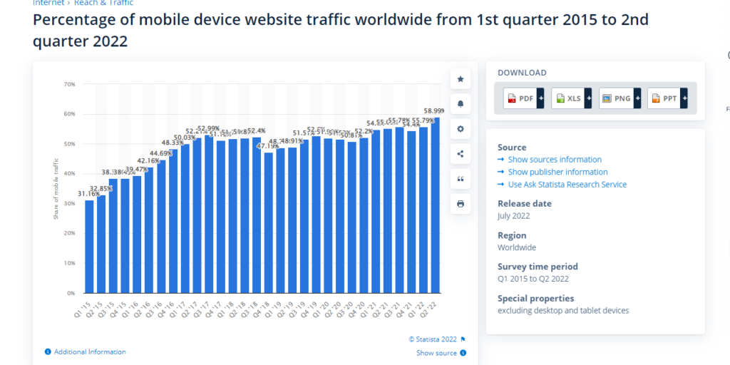
5. Make the eCommerce site mobile friendly
Another key thing is making the eCommerce site mobile-friendly. The use of smartphones has grown over time and people are making purchases from the comfort of their phones.

It is estimated that 79% of mobile users purchased items online in the last 6 months, as they find it easier to buy something with their phones rather than on computers.
Also, most people have smartphones and this has led to their popularity. There are about 10 billion mobile-connected devices in use globally. This shows that if you invest in a mobile-friendly eCommerce website, you can gain more customers over time.
i. Stylish website
The website needs to be comfortable, stylish, visually appealing, and elegant. User-friendliness is key to ensuring easy navigation on the site. The menu should also be easy to navigate through and entail the important pages and subpages.
ii. Social media integration
Many people access social media sites from their phones. Therefore, integrate your social channels with your website to make it easier for people to get in touch with you on their favorite platforms.
Customer engagement is also effective through social media platforms. You can introduce discounts, new arrivals, special offers, gift cards, and much more through social media sites and email marketing. Try to make the information attractive to increase your website visitors.
iii. Keep it simple
People don’t like over-complicated stuff. The more distractions there are, the more, it diverts the customer’s attention.
Also, remember to research and use the best eCommerce platform for the online store. Are you selling physical or digital products?
iv. Have social proof
Have a section to showcase your customer’s reviews and experiences with your products or services. If they are satisfied with the product, let them leave reviews and even provide general feedback.
This can increase your sales opportunities as people like seeing evidence that other customers have bought something from you.
They want to know what they can expect from your business. Are your goods original or counterfeit? How’s your customer service?
Attract more customers to your online store
If you want to increase your customer base, you need to make your website more appealing. A professional website will make your visitors feel confident about what you are offering and don’t have any doubts at all.
To achieve that, consider; how you feel when you visit the website.
Also, strive to invest in social media and email marketing to build great customer relationships. Marketing also plays a critical role in boosting your sales. So, what are you waiting for? Make your website more appealing today!


2 Comments
An appealing website can make all the difference in luring and keeping customers in the cutthroat world of eCommerce. The user experience can be improved and ultimately result in higher sales with a visually appealing website design, simple navigation, and clear product descriptions. The buying experience can be improved by include interactive components like videos, virtual try-on tools, and customer feedback. A website’s optimization for quick loading times and simple checkout can also lower the rate of shopping cart abandonment and raise overall consumer satisfaction.
Making an eCommerce website attractive is crucial to engage potential customers and drive sales. There are several key elements to consider when designing a visually appealing and user-friendly online store. A clear and easy-to-navigate layout, high-quality product images and descriptions. By focusing on these key elements and continually optimizing and improving the website.